

In 2016, the finance company MSCI released a study claiming that CEO pay bears no link to company performance. It couldn’t have been better timed. That year, soaring CEO pay was controversial on both sides of the Atlantic. The UK government was so concerned that it launched an official inquiry into it (and other aspects of how companies are run).
Why the outrage? Not just because CEO pay was so high, because most people accept that you should be rewarded for a job well done, but that pay seemed to bear no relation to company performance. MSCI crunched the numbers to see if these concerns were valid — and they were. The first sentence of the report was ‘Has CEO pay reflected long-term stock performance? In a word, ‘no’.’
The study confirmed everything people thought to be true. As a result, it became highly influential, and was paraded by the Wall Street Journal, CNN, and Fortune as cast-iron proof that executive pay is out of whack. Its smoking gun was the following graph:
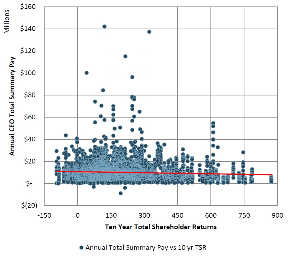
The horizontal axis was company performance (total shareholder return) over the past 10 years, and the vertical axis was CEO pay. The best-fit line (the red line) couldn’t be any flatter. There’s no relationship between CEO pay and performance — regardless of how his company fares, the CEO gets paid the same. Case closed.
Actually, it’s wide open, because the study missed the biggest component of CEO pay. The vertical axis, ‘Annual CEO Total Summary Pay’, only includes the salary, bonus, and new shares that a CEO receives in a given year. But the vast majority of a CEO’s incentives come from shares and options that he was awarded in prior years. Take Steve Jobs, who was paid $1 a year regardless of how Apple did. Yet he was hugely affected by Apple’s performance, because he owned $2 billion of Apple shares when he died. If Jobs underachieved, his salary wouldn’t change, but his Apple shares would lose millions in value.
This is far from an isolated case. One of my papers finds that the average Fortune 500 CEO holds $67 million of equity, and so if the stock price drops by 10%, he loses $6.7 million. That’s equivalent to a $10 million pre-tax pay cut, but is completely missed by MSCI’s analysis.
The implications are worrying, and go far beyond this particular study. We often think the problem with data is outright fraud. The website Data Colada exposes cases where researchers fabricated their data. Less egregious, but still serious, is when authors misrepresent what their data actually captures, like in this case.
Here, both the data and the description were accurate, but the inferences were completely misleading because the data missed the biggest piece of the picture. It doesn’t matter how good your camera is: if it’s focused on only one tree, you’ll never see what the forest looks like.


